Shop-timised Imagery
Are you making it harder for your customers to choose your product on a mobile device?
When it comes to e-commerce and selling online, not only do we need to consider what is the best imagery and content that sells the product, but also the device that your customers are using. Many of use are turning to our mobiles for ease and speed.
“By the end of 2020, 66.7% of all UK shoppers were using their mobile phones to order new products”
Improve product sales and UX with mobile optimised imagery


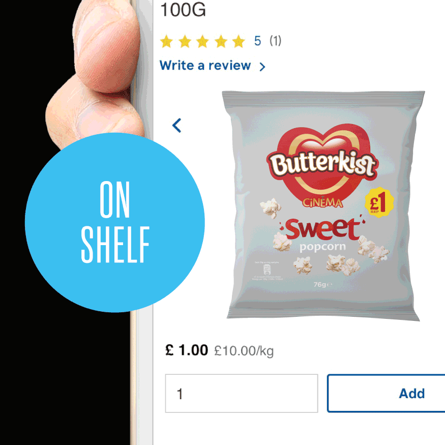
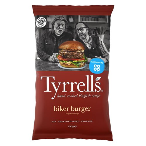
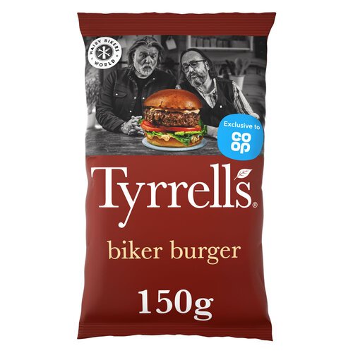
Standard Pack
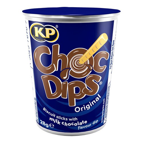
Standard Pack
Optimised Pack
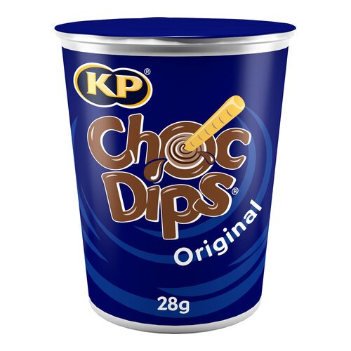
Optimised Pack
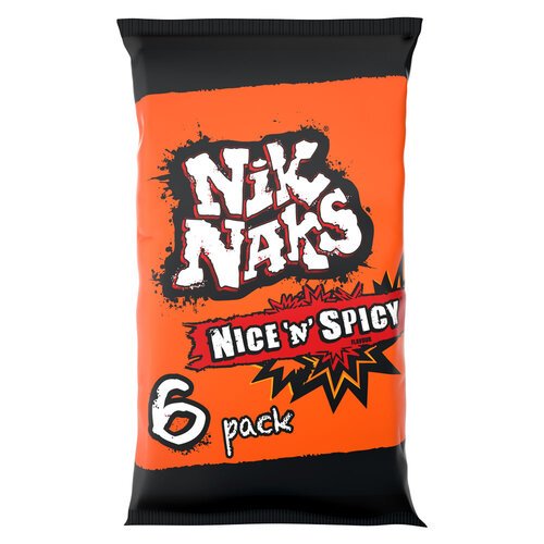
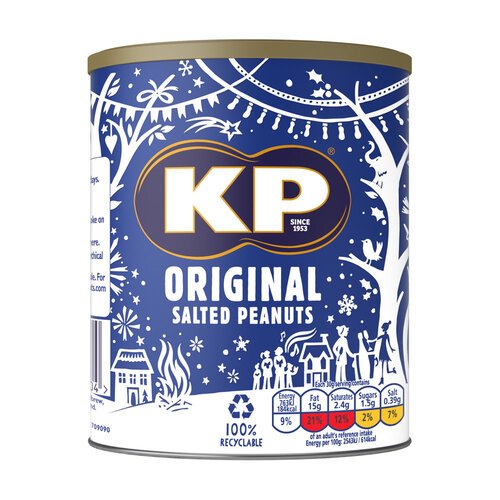
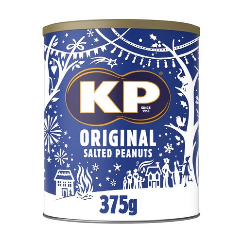
Standard Pack
Standard Pack
Optimised Pack
Optimised Pack
Mobile image optimisation ensures your images are relevant when viewed on small format digital devices. It recognises that your product imagery has multiple viewing platforms, and as such requires multiple faces to show itself off best to consumers. Whereas a true-to-pack render may be fine for use on your desktop site, that kind of imagery will fail to thrive when used on a mobile or tablet screen.
A pack that is busy with information such as weight, size, USPs and nutritional information is great in your hands or viewed on a laptop screen, but shrink down that same pack image to a thumbnail on a screen in your palm, and suddenly it takes a lot more mental decoding before wary consumers decide to add it to their virtual baskets.
Mobile image optimisation is, at heart, a simple enough task, but due to the nature of the creative industry, it requires a skill set that rarely sits under the same roof. You need the eye of a designer to ensure that a stripped-back pack still retains brand identity and key information, a CGI artist’s skill to create quality renders in fast turnaround times, and a manager’s discipline to keep the flow of images moving to deliver back to the client with minimal disruption.
At WK360, we’ve always believed in the strength of our 360 end-to-end approaches. Using the best talent, and the most up-to-the-minute infrastructure in the form of our render management system, we can undertake your mobile image optimisation project from start to finish, without it ever leaving the building.