E-Commerce Evolution
Making imagery work for mobile shopping
According to Forbes.com, 20.8% of retail purchases will be made online in 2023, with eCommerce markets expected to total $6.3 trillion by the end of the year. But the key question is how are those purchases being made? When polled, 69% of respondents told Statista.com that they used a smartphone for online shopping, with laptops and tablets making up the top three. Only 23% of respondents were using a desktop computer. So how are those highly detailed, true-to-pack renders working for your customers? The answer is – they're not.
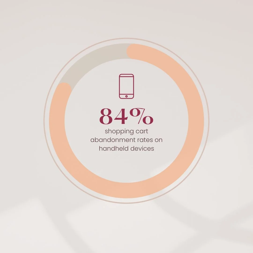
With online shopping cart abandonment rates on mobile devices at an average of 84%, it’s clear that the UX for mobile ecommerce could be optimised, and the first step to achieving this is through optimised imagery.
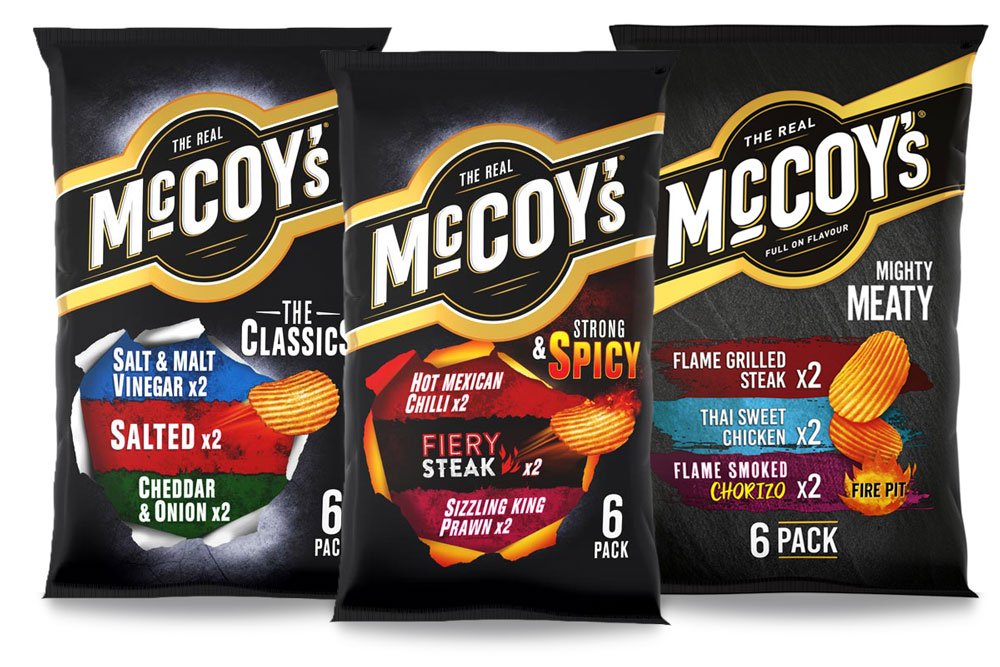
TRUE-TO-PACK VS OPTIMISED
True-to-pack renders are a vital component in your eCommerce asset library. They provide an accurate representation of your product that’s suitable for marketing, internal comms, your desktop eCommerce sites, and your multi-channel advertising. When you’re still waiting on production lead-times, they can get you off the starting line by providing photorealistic imagery before your product is ready for market. But that kind of imagery is failing to thrive when it is viewed on a mobile or tablet screen. A pack that is busy with information such as weight, size, USPs, visuals, and nutritional breakdowns is great on shelf, or viewed on a desktop screen, but shrink down that same pack image to a thumbnail on a screen in your palm, and suddenly it takes a lot more mental decoding before wary consumers decide to add it to their virtual baskets.

WHAT TO TAKE OUT, AND WHAT TO LEAVE BEHIND?
Mobile image optimisation is the process of optimising FOP renders for better viewing via a smartphone, specifically stripping down the information on pack to hero facts consumers need to see before they commit to purchase. You might not think that your FOPs are cluttered, but when you’re looking at them on a small screen, they can be busy and hard to visually decode. You’re aiding this mental decoding process by removing information that’s not strictly necessary for the initial purchasing decision. Consumers want to know, quickly and easily, is it the right pack size or quantity? The right flavour/scent? Are there any allergy warnings or safety flags? Optimisation makes sure this triumvirate of information is retained and displayed in a clearer way for small format devices. Retaining logos and pack colours is also important, as they provide familiarity and reassure consumers that this in fact a legitimate product from your brand.


WHAT ARE YOUR OPTIONS?
Mobile image optimisation is, at heart, a simple enough task, but due to the nature of the creative industry, it requires a skillset which rarely sits under the same roof. You need the eye of a designer to ensure that a stripped-back pack still retains brand identity and that triumvirate of key information, a CGI artist’s skill to create quality renders in fast turnaround times, and a manager’s discipline to keep the flow of images moving to deliver back to the client with minimal disruption. At WK360, we’ve always believed in the strength of our 360 end-to-end approach. For us, outsourcing is outdated. Using the best talent, and the most up-to-the-minute infrastructure in the form of our render management system, we can undertake your mobile image optimisation project from start to finish, without it ever leaving the building.
If you would like to know more about how mobile image optimisation could help improve your eCommerce sales, contact us.